UX Strategy Portfolio
Explore our portfolio to see how Humanjava Enterprises can elevate your digital experiences and drive your projects to success. Whether you are a large corporation or a startup, we are here to help you describe and deliver exceptional digital experiences.

User Experience is part art, part science, and 100% capturing business decisions in a format for moving the project forward. Over the years, we (me) at Humanjava Enterprises have developed UX artifacts that assist in getting to the most critical parts of a project. These artifacts have helped development teams, internal stakeholders/partners, and senior leaders, in bringing the project / products to life. Regardless of the size of the organization, we're happy to help large organizations and startups describe their digital experiences.
If you find the work presented here interesting, reach out to me on social media(s) as @vveerrgg via Twitter, Instagram or LinkedIn.
CAMH.ca
Nuancing website visitors on their "Learning ____ to Doing ____" journey.
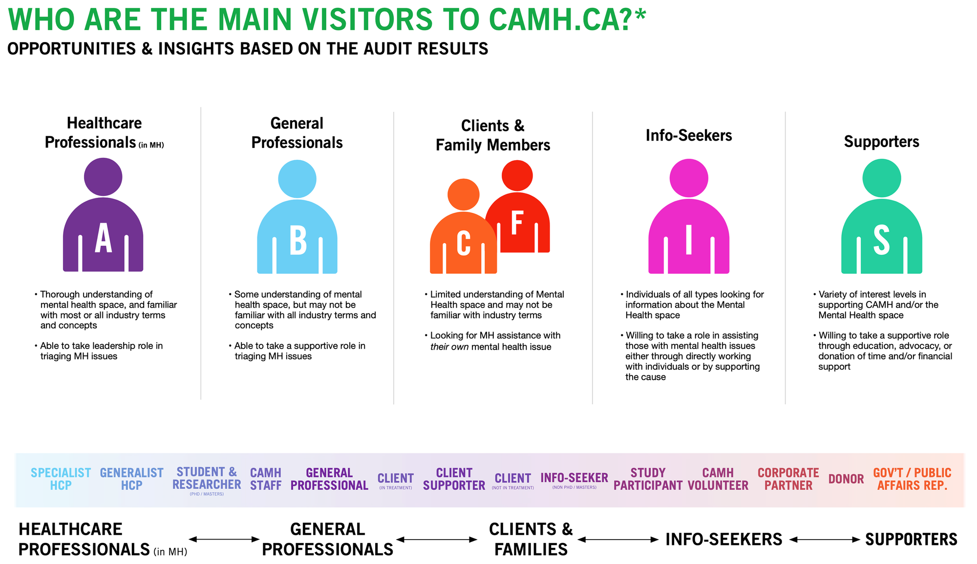
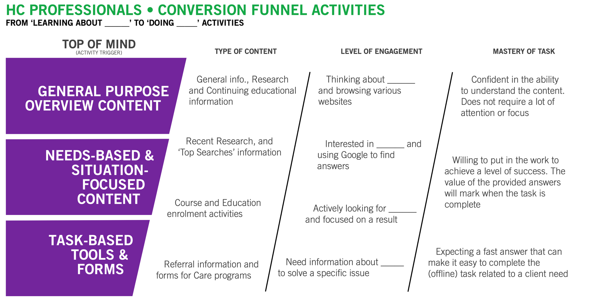
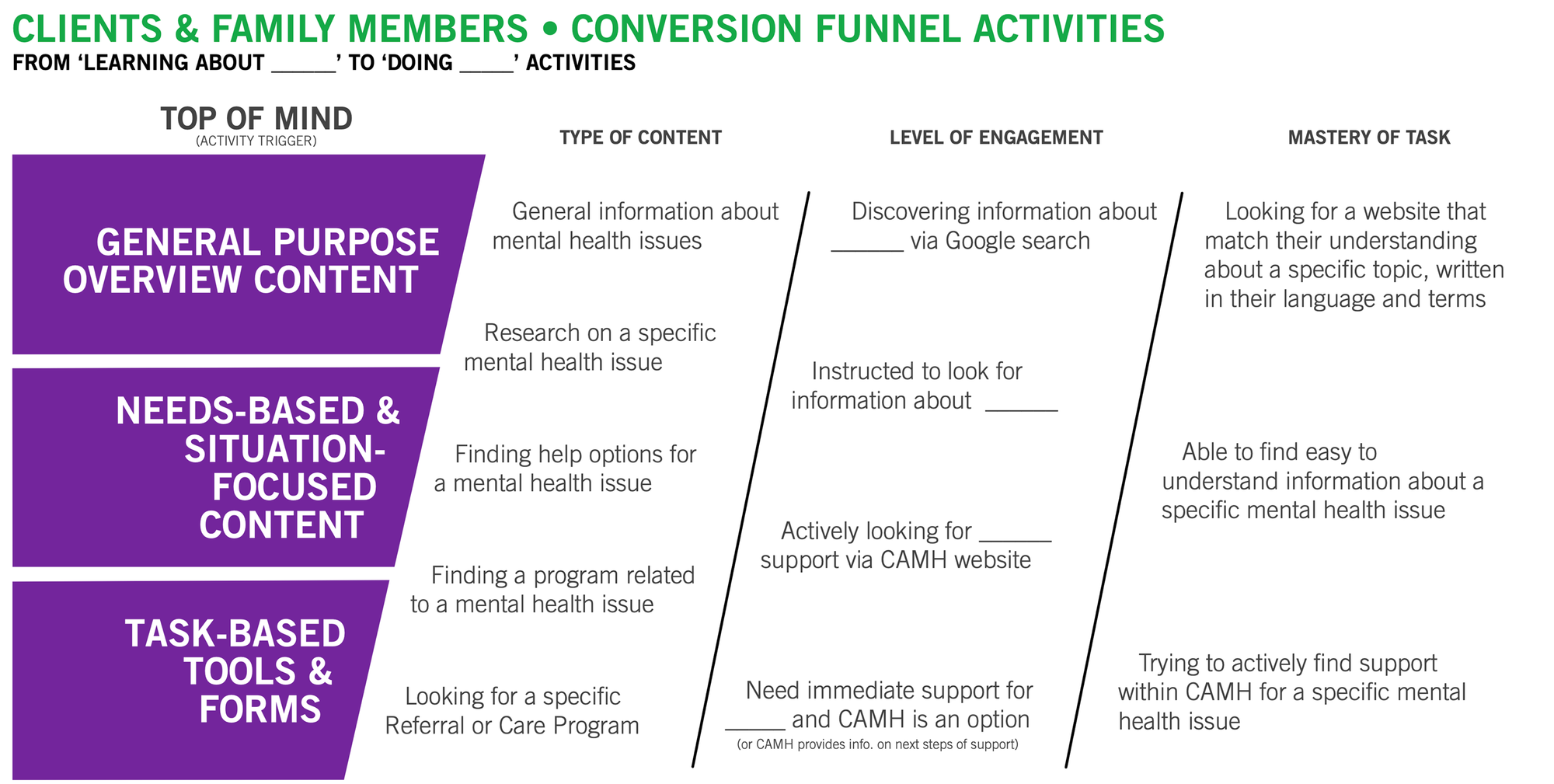
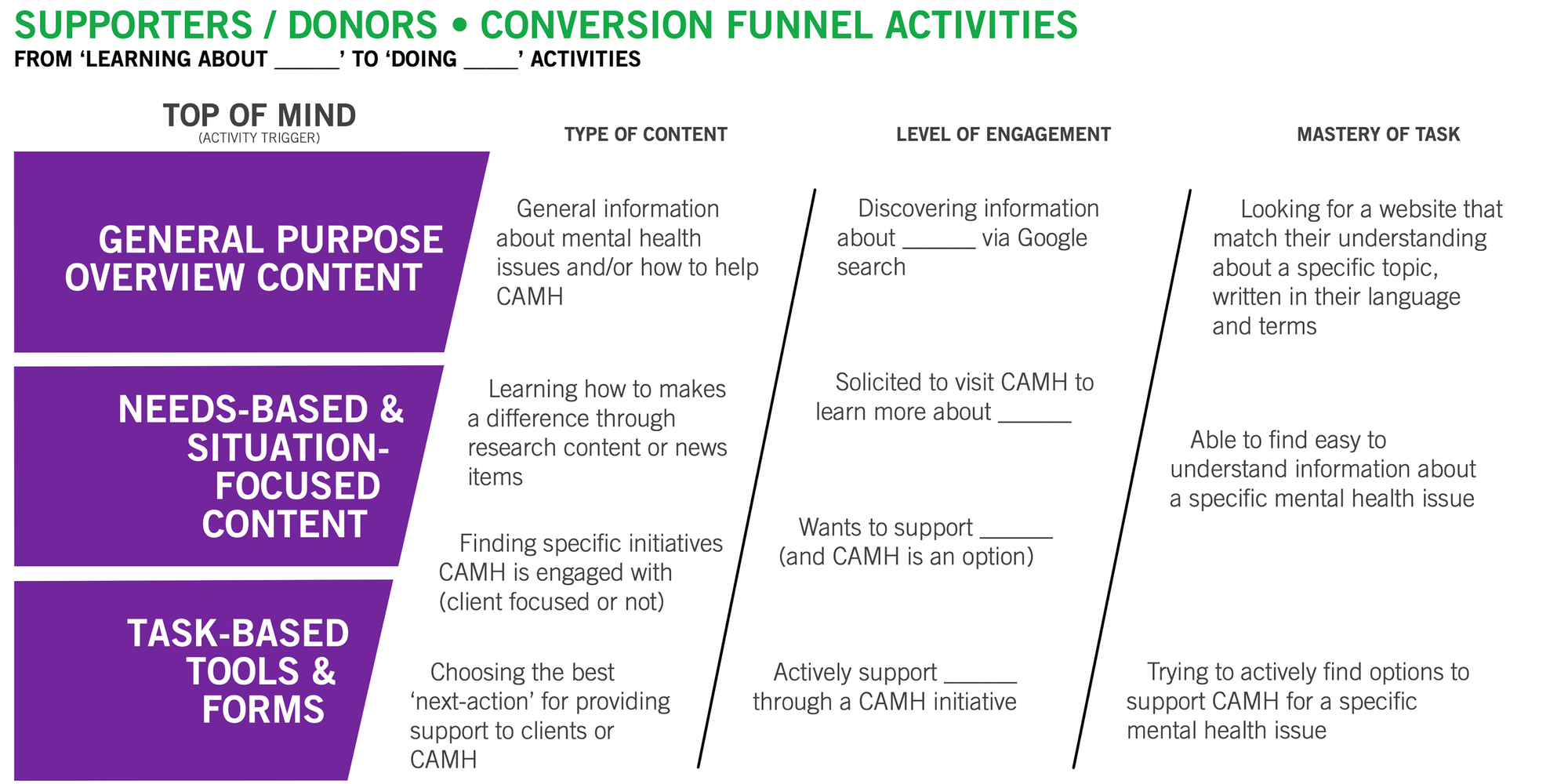
Facilitating the project team(s), along with CAMH leadership, we crafted the user experience on CAMH.ca to cater to the diverse needs of its visitors through a conversion funnel approach.
At the top of the funnel, the website provides general mental health information for those new to the topic. Moving to the middle funnel, it offers detailed, situational content for individuals seeking specific information or support. Finally, at the bottom of the funnel, the site facilitates task-based interactions, such as filling out forms or scheduling appointments, to help users engage directly with CAMH services.
The strategy ensures that visitors, regardless of their knowledge level, find relevant information and clear next steps. By accommodating varying needs and expectations, CAMH.ca effectively supports users on their mental health journey, from initial awareness to actionable engagement. This thoughtful design aligns with Humanjava Enterprises' commitment to creating empathetic and impactful digital experiences.
Visitors have quite a few reasons in visit the website with many top-of-mind considerations. Their needs range from a high-level general understanding to those looking for a specific service or treatment option:
Skills/Knowledge-base - Visitors may have a wide range of education/exposure to mental health language or terminology
Constraints Considerations - Each visitor group will have unique needs and level of understanding
Success Expectations - Each visitor group will expect “Next Action” activities based on their needs and/or perspective of CAMH and the services it provides
The resulting work from this strategy and planning engagement went on to become the foundation for a full website and information architecture redesign. On larger projects like this, it's best to bring everyone in early, facilitate a series of design sprints, level-set the expectations of What Success Looks Like, before designing the new future of the web experience.
Chip Reversible Mortgage
Visitor-type analysis via the Trigger / Action / Response framework
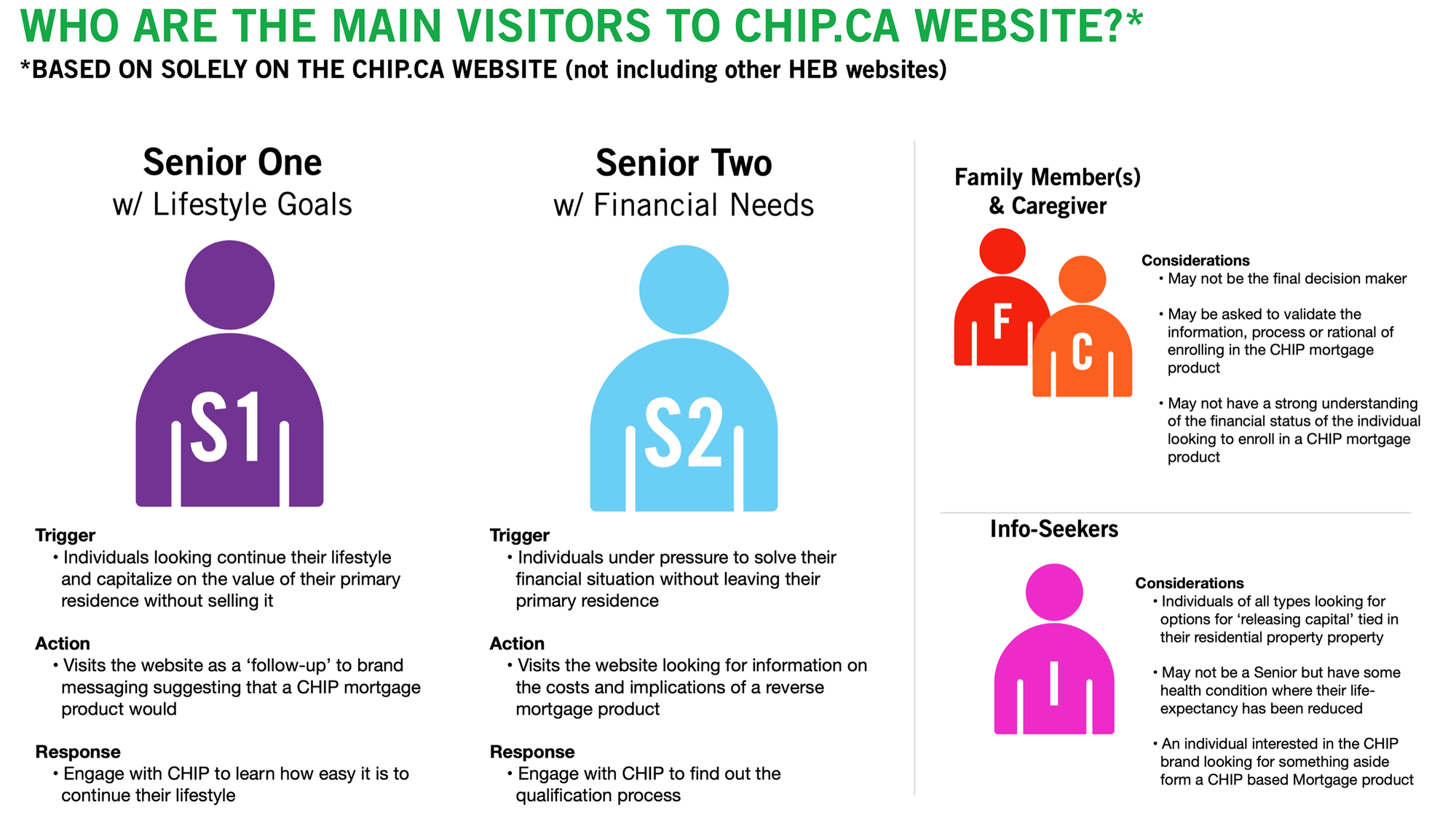
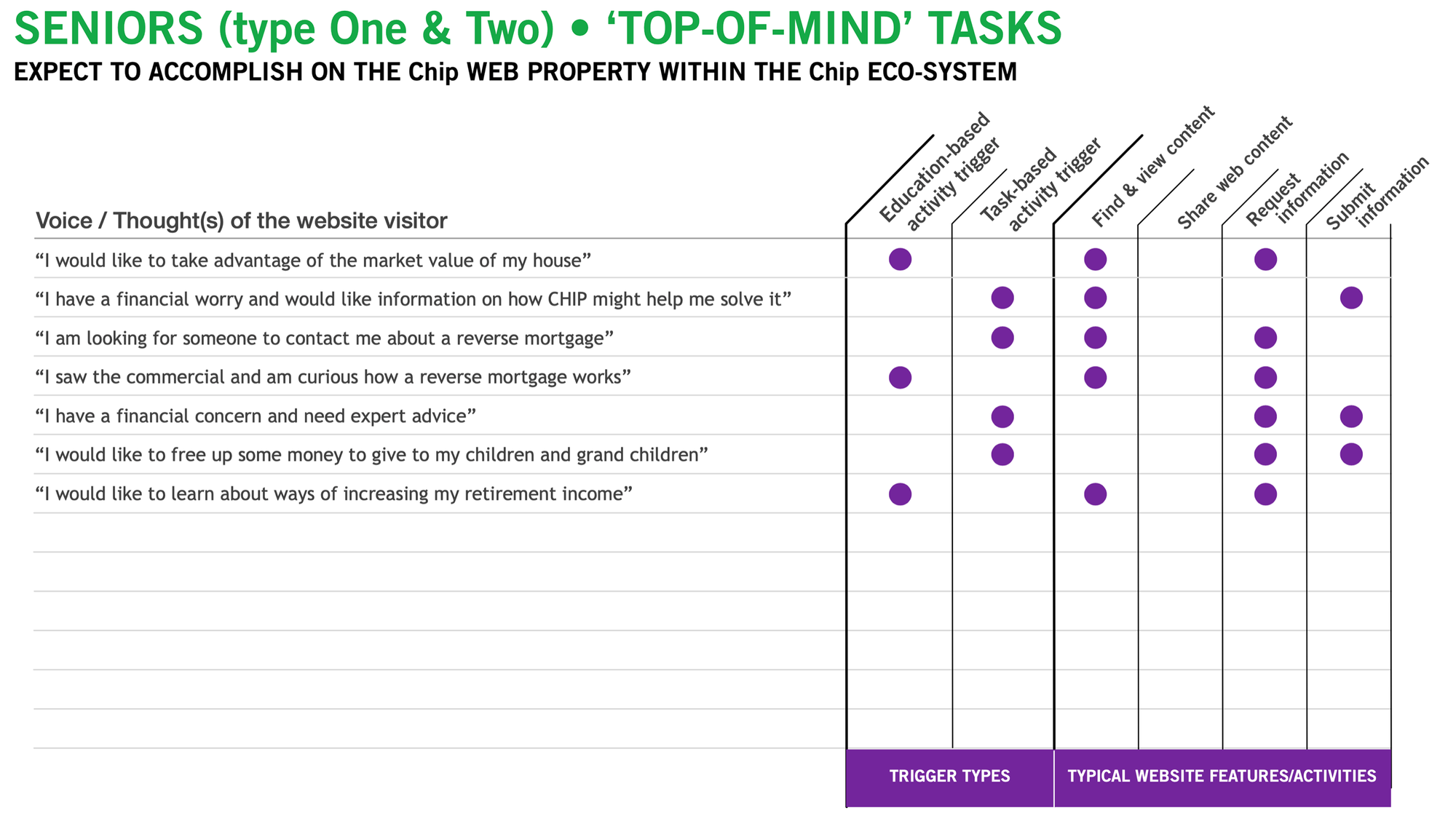
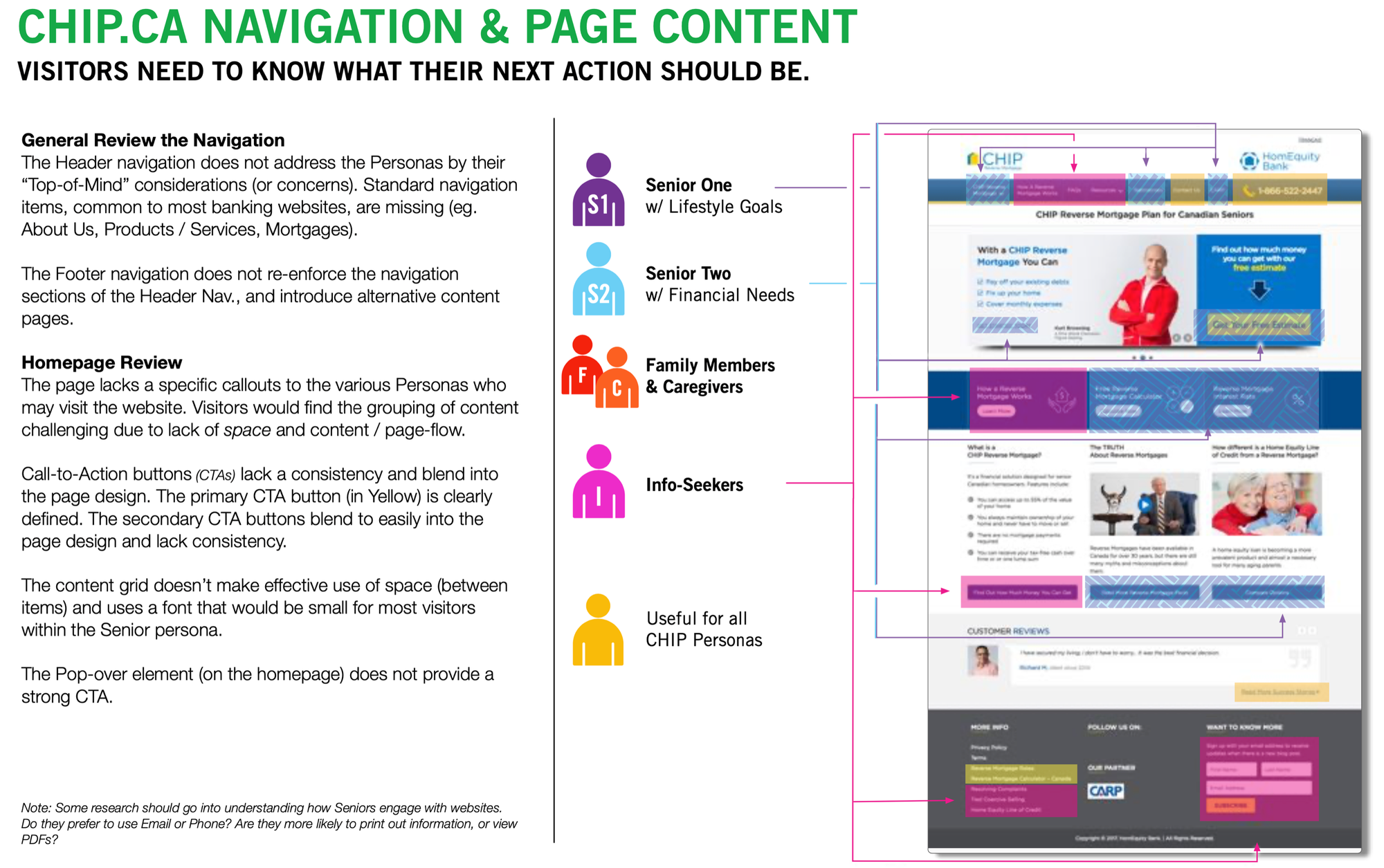
Through a series of research activities, it was revealed that visitors to the Chip website often had a "top of mind" idea or concern driving their search for information or solutions.
To help build out a strategy to evaluate the success of the current website, and framework for designing the next version, Vergel created a series of strategy artifacts to help bring all levels of the organization together in understanding where there were opportunities to improve the customer experience.
The strategy helped to showcase the importance of providing targeted content, insightful information, and clear next actions. And in doing so, the content would address these diverse needs effectively. Understanding these visitor types and their top-of-mind needs is crucial for creating impactful digital experiences, as illustrated by the insights shared below. The visitor types, as identified through the project, were grouped by their Top-of-Mind needs fit into:
Senior Individuals who have a lifestyle driver - looking for income options to continue their lifestyle
Senior Individuals who have health issues - looking for assistance to cover short/medium term bills
Senior Individuals with financial issues - looking for a long term financial solution
Senior Individuals with family obligations - looking to financially assist children or grand-childrenSecondary
Family & Caregivers looking for support options - to fulfill the lifestyle requests of a Senior.
The project closure focused on identifying tailored resources, educational articles, and actionable steps ensure that visitors find the assistance they need, fostering trust and engagement. Enabling CHIP to bring customers in using the existing customer acquisition processes and online tools.
Interac.ca
Information architecture analysis across various dev portals within the industry
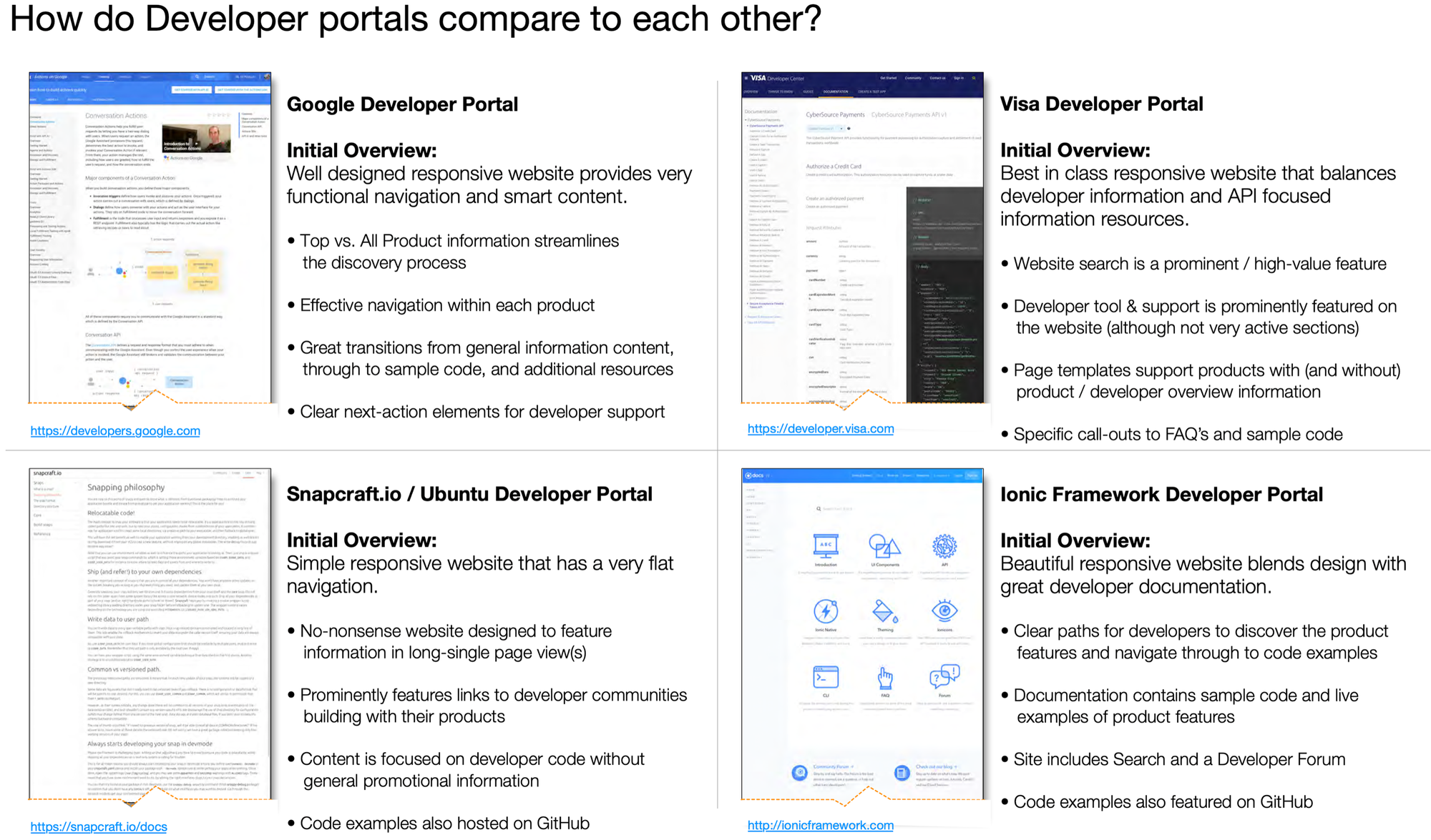
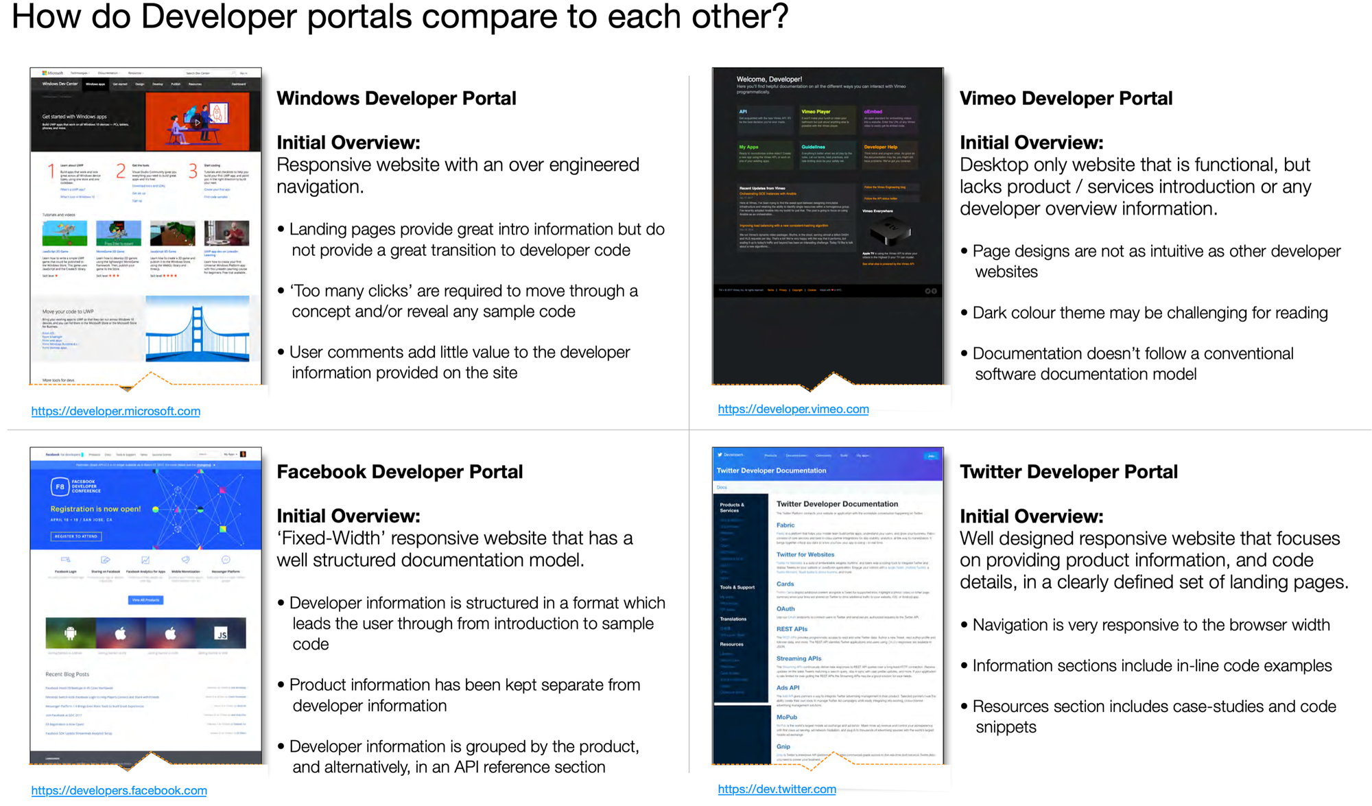
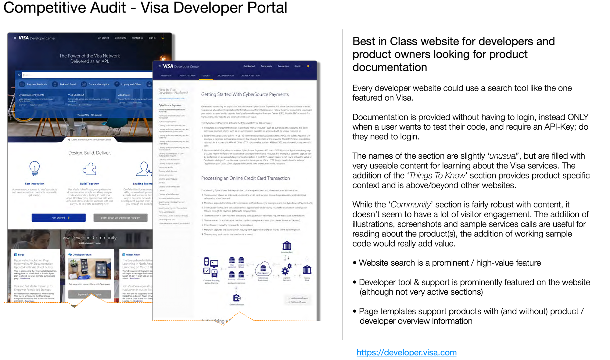
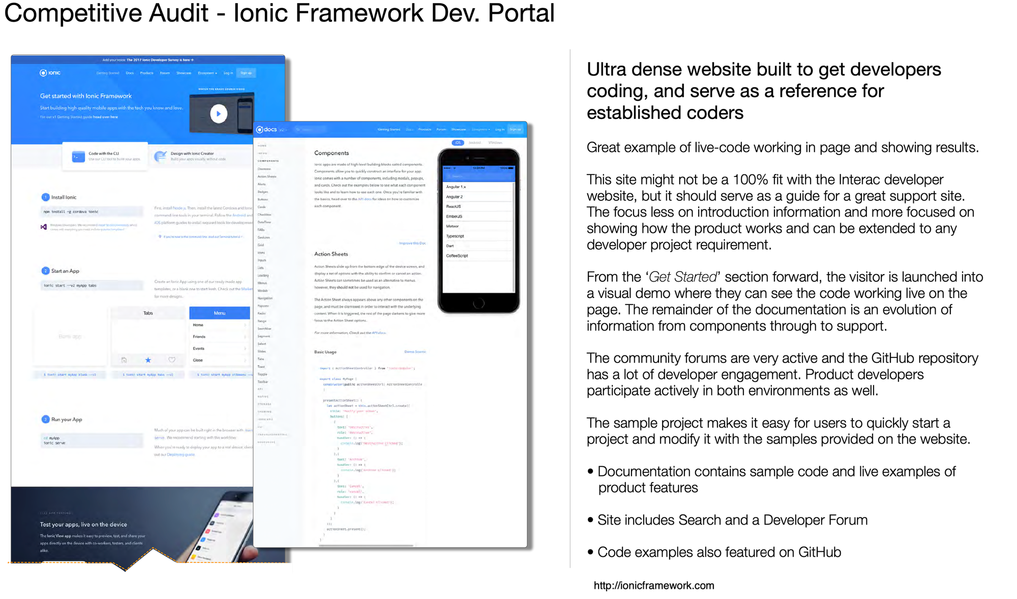
Working on behalf of a marketing company we were asked to audit and pitch ways of improving the Interac Developer portal. In the process of reviewing other website within the space, it became clear there were some common issues across the industry, and a few best in class examples.
This comprehensive analysis identifies current trends, common industry issues, and best practices, ensuring that the redesign exceeds user expectations. For example, top-performing developer portals offer robust search functionalities, mirror code snippets on GitHub, and provide clear navigation.
The resulting suggestions were utilized to help address challenges like, overly long pages, and documentation that wasn't easily findable based on a real world issue. Additional opportunities of integrating marketing information with technical resources became a crucial insight that was considered, at the time, "new knowledge" and gained from the audit.
A market scan audit is essential for redesigning a website, web application, or mobile app. Humanjava Enterprises is an ideal partner for these early-stage activities.
Ministry of Transportation
Evaluating the Microsoft HaloLens VR options for reviewing architectural docs
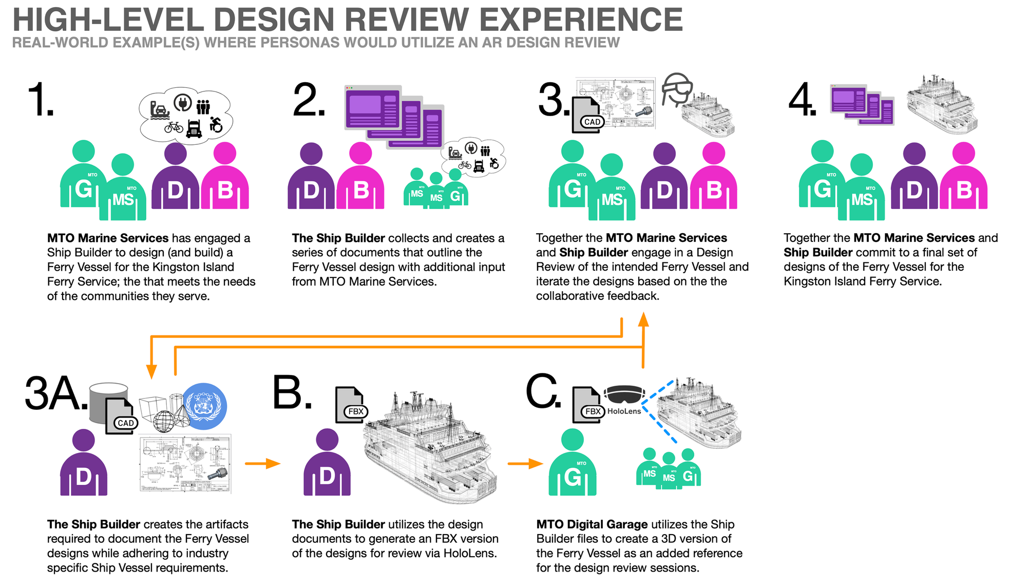
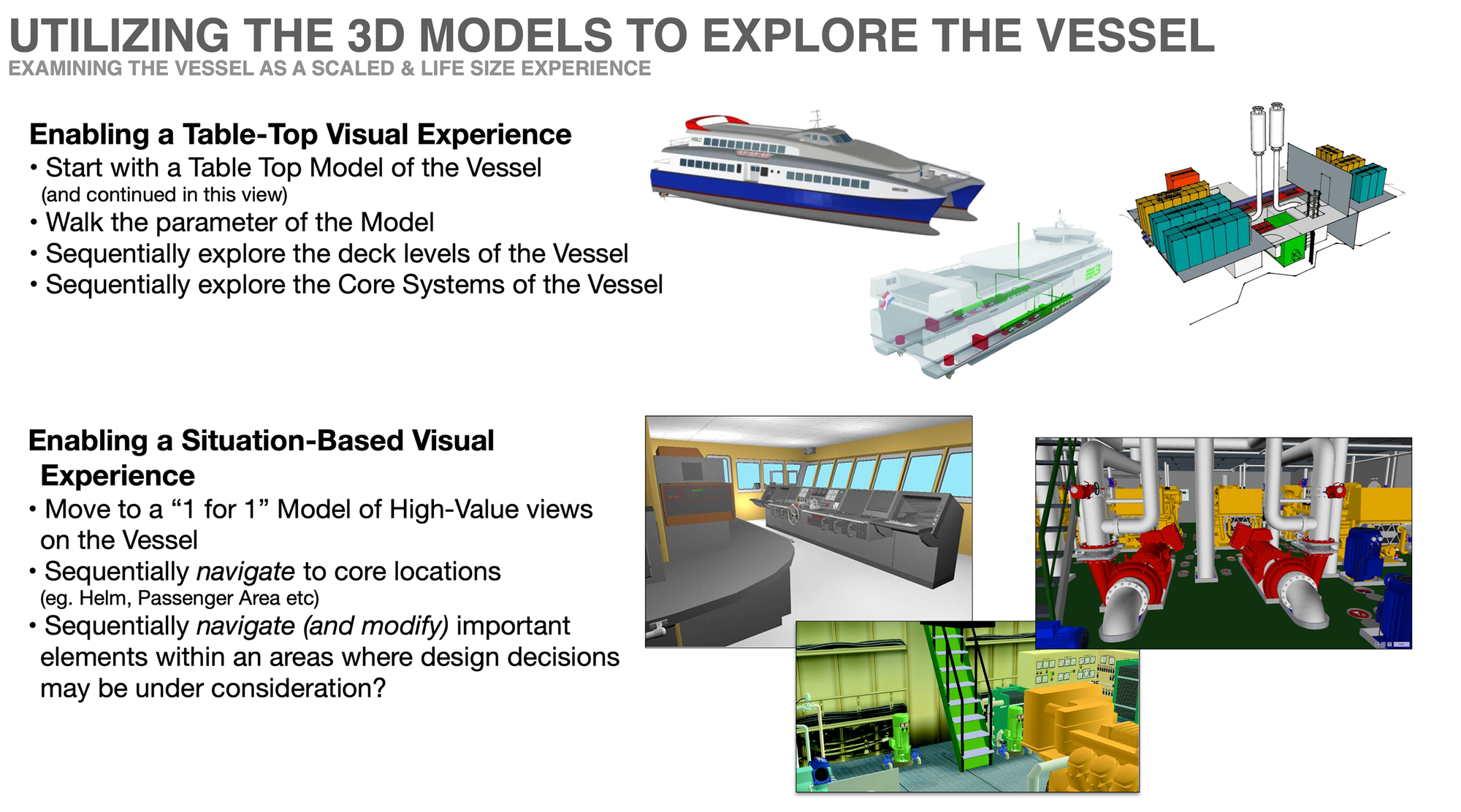
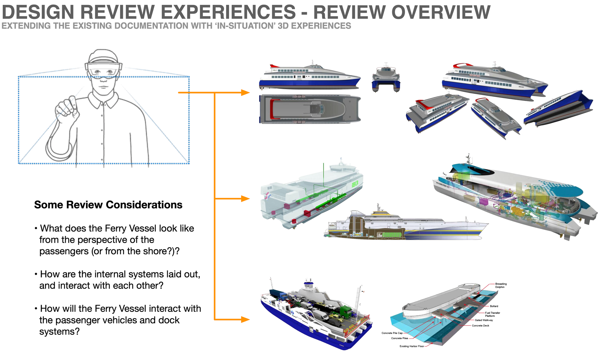
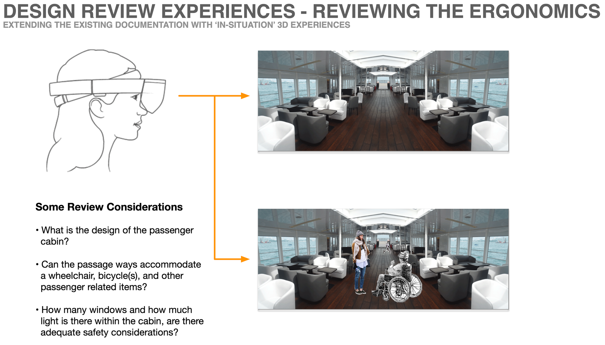
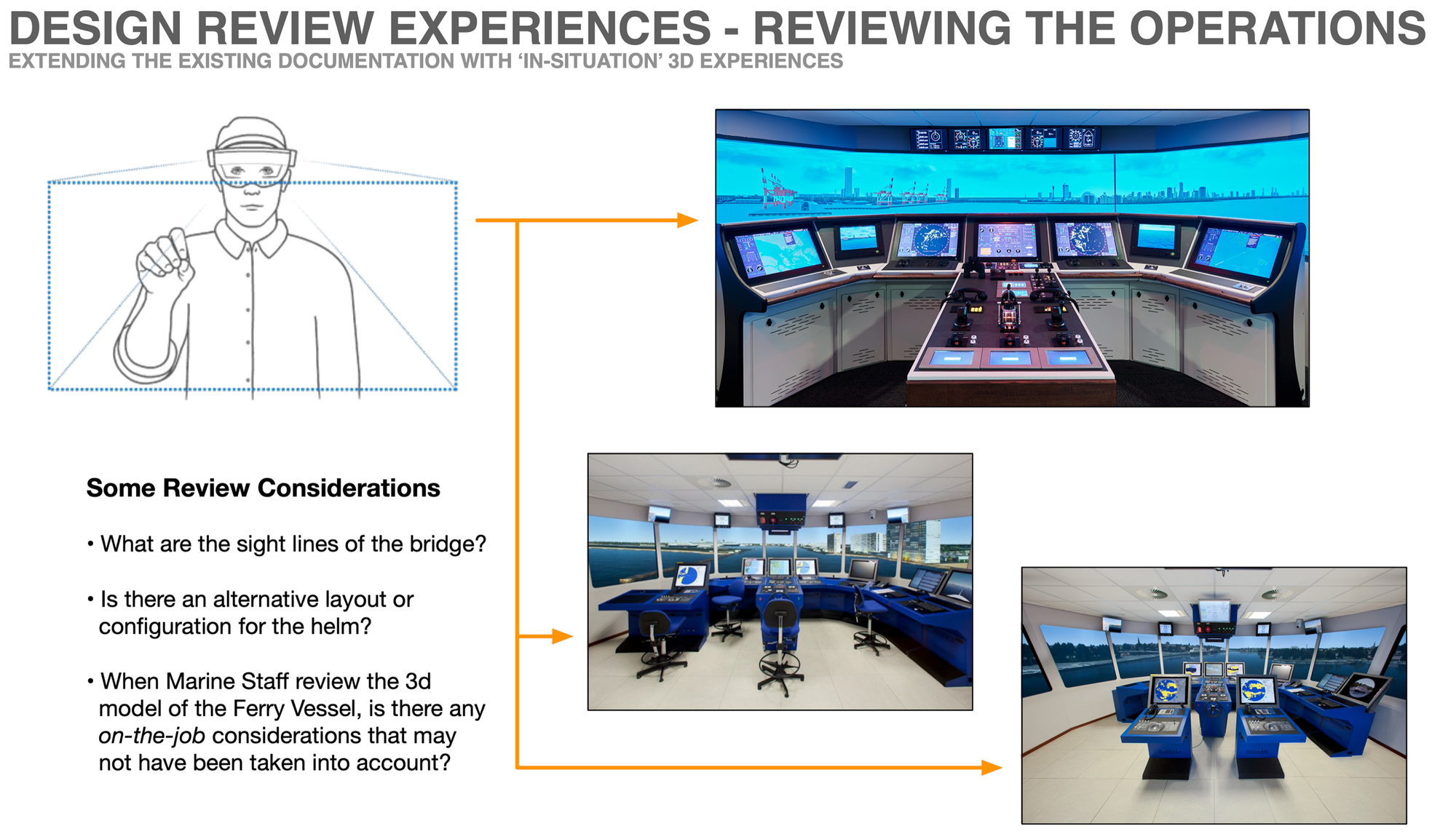
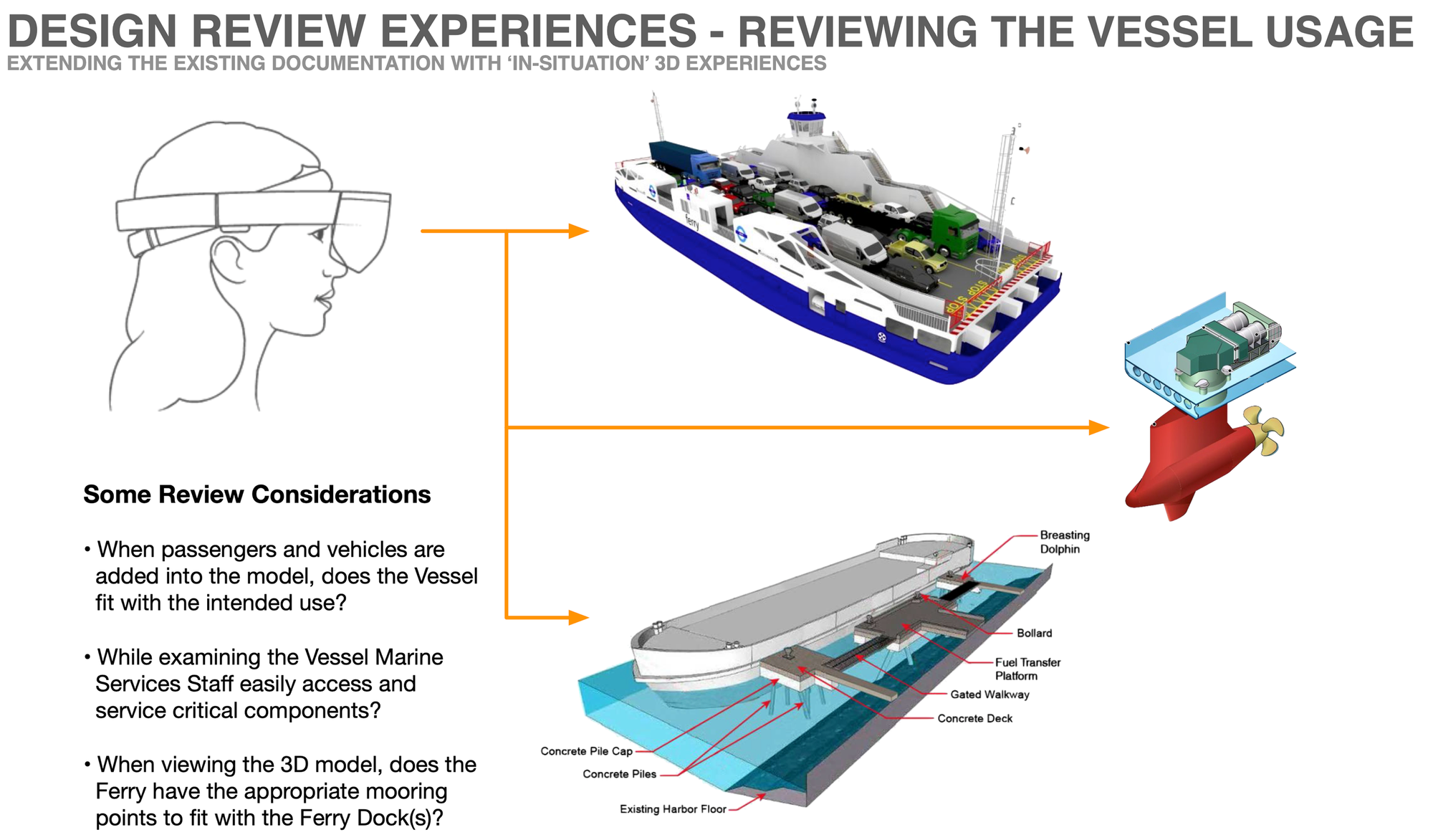
Embracing new technologies like virtual reality (VR) and extended reality (XR) is crucial for exploring innovative ways of viewing information and transforming user experiences. VR offers immersive, interactive environments that can make complex data more accessible and engaging, enhancing user comprehension and retention.
In a project for MTO Marine, we asked: Can we use XR (which includes both VR and AR) to enable the design team to make better-informed decisions for a new ferry vessel?
Traditionally, ferry vessel design relied on CAD files and 2D documentation, which were not ideal for design reviews. Updates required multiple rounds of impact assessments, taking months to finalize changes. Tracking and ensuring design changes did not adversely affect the overall design was a chronic issue within the industry.
By using 3D models and AR, the design team was able to review designs more accurately and efficiently, significantly reducing the time required to confirm and resolve design changes.
This project exemplified how XR enhanced the design processes, making them more dynamic and effective. It showcases how the team within the Ministry of Transportation / Digital Garage could help advise and guide uses of cutting-edge technology (like XR) to improve existing business processes, and participate in delivering solutions that are both innovative and highly effective.
While this project was a one-off example and collaboration with Microsoft, it was an early example of how XR would impact the types of projects being completed within the Ministry of Transportation.
Accora Village
Moving from a desktop only to a responsive web templated system
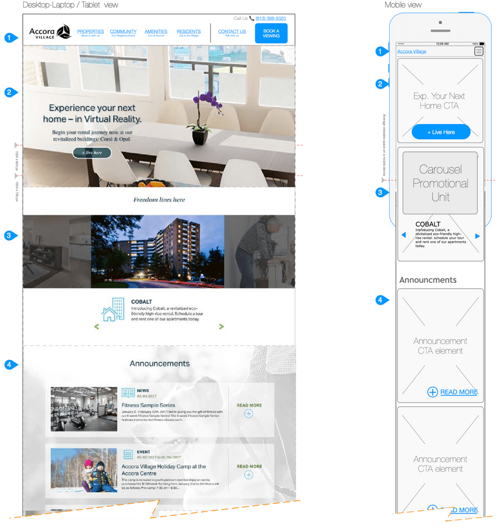
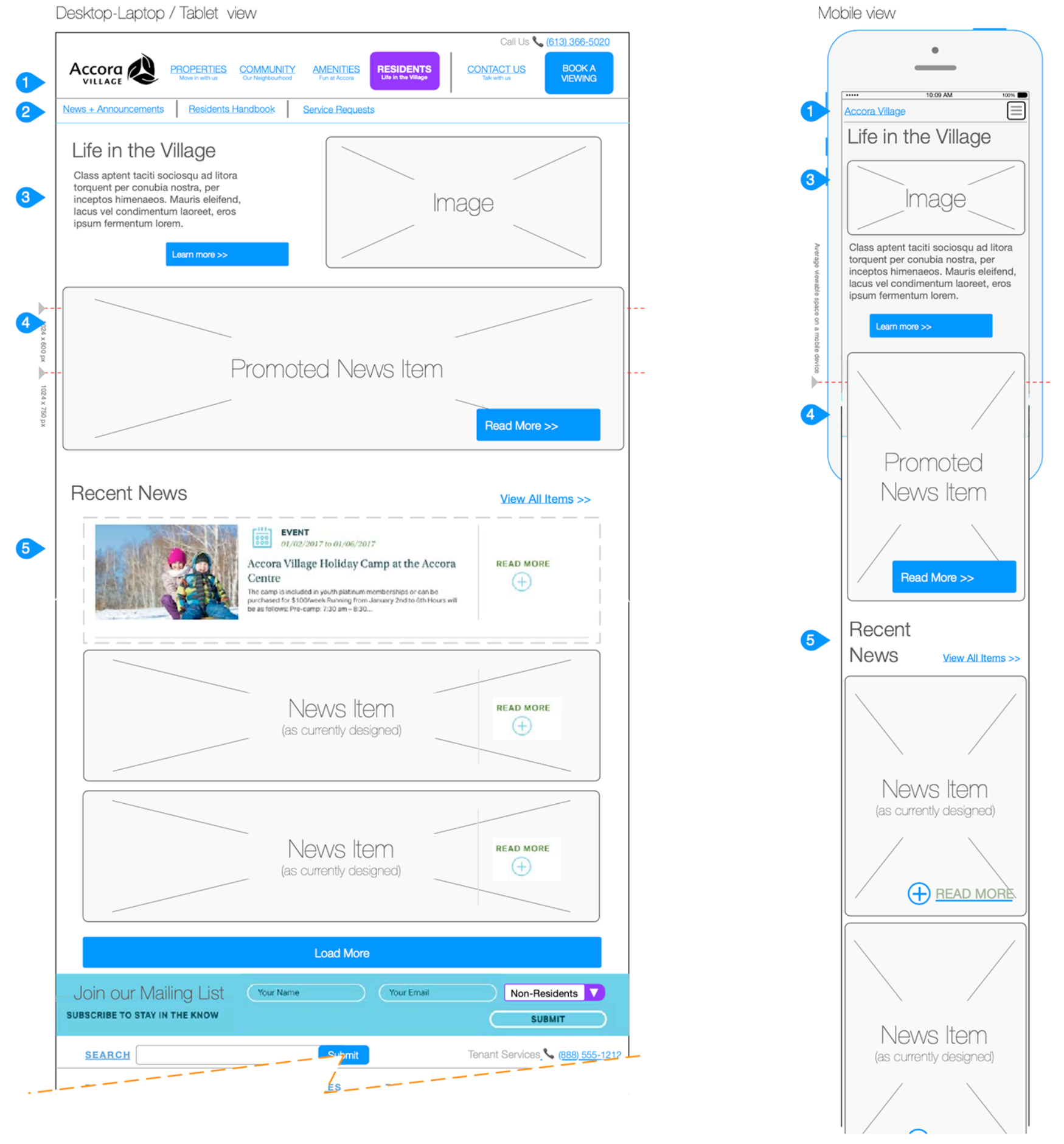
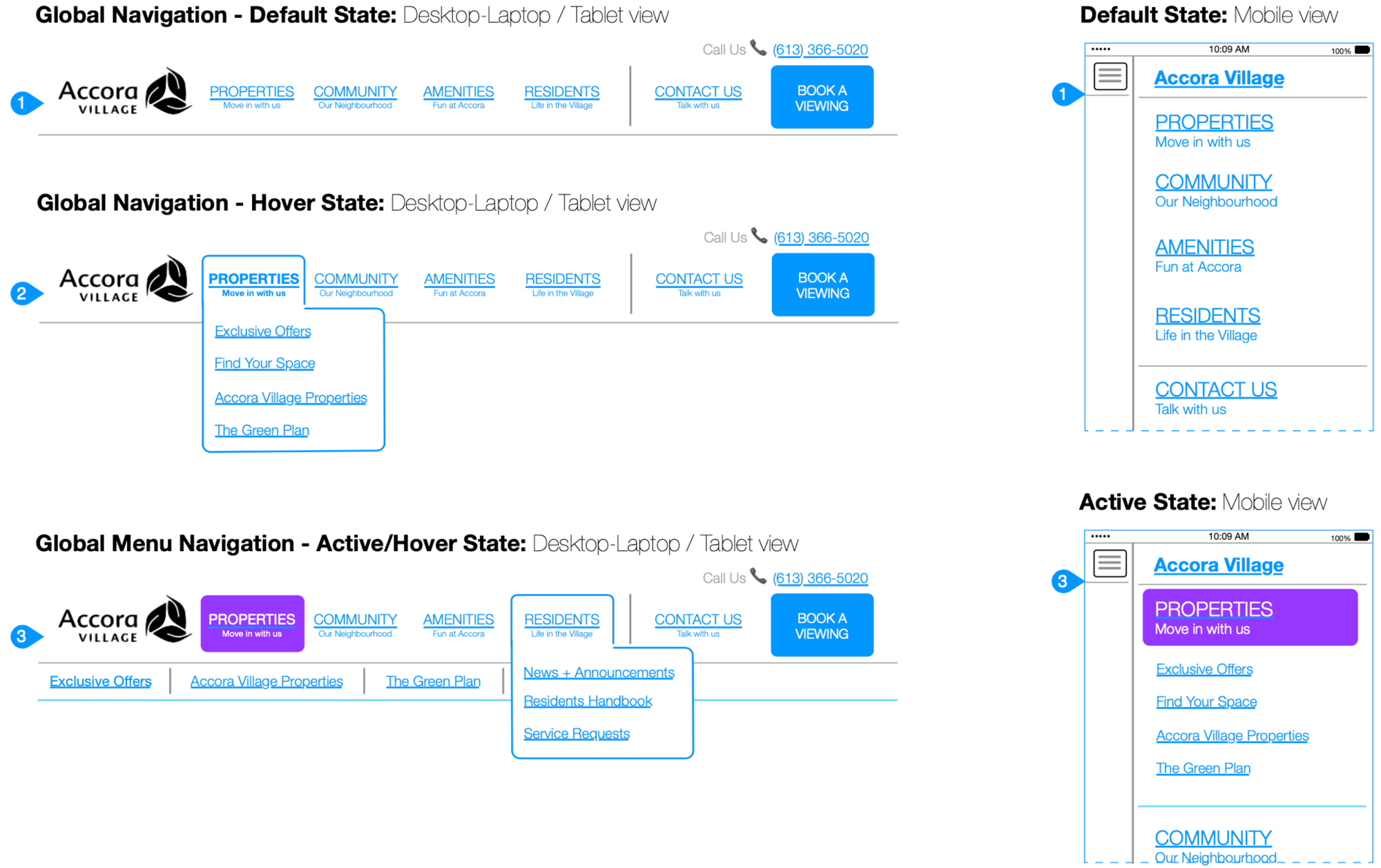
Migrating a desktop-web website to mobile can be a challenge. When photos, easy to read tables are critical to making decisions. The importance of being receptive to the business AND the customer was critical on this project; especially when it comes to helping people on their apartment hunting journey.
In working with Accora Village, the strategic vision involved extending the current implementation of the website while enhancing its content and navigation. By tweaking the user experience, we aimed to elevate the activities visitors engage in when exploring the website. Our approach included:
- Responsive Design: Ensuring every webpage functions seamlessly on mobile devices, serving as a landing page that guides visitors to clear next actions.
- Comprehensive Content: Expanding the website's scope beyond just serving potential new tenants to include valuable information for current residents.
- Resident Resources: Providing residents with easy access to information about daily life activities and services associated with being a tenant.
- Integration of Third-Party Tools: Using third-party tools to enhance the visitor and tenant experience, offering features that streamline apartment hunting and tenant management.
- High-Value Content for Tenants: Supporting existing tenants with rich, valuable content that addresses their needs and questions.
- Central Hub for Tenants: Promoting the website as the go-to destination for tenants' first-level inquiries, effectively supporting property managers.
- Social Media Integration: Resonating with social media content and incorporating relevant updates directly on the website to keep tenants informed and engaged.
- Engagement and Marketing: Encouraging tenants to join mailing lists and other value-add programs, and marketing relevant partnerships to these members.
By implementing these strategies, we transformed the website into a responsive, user-friendly platform that significantly improved the apartment hunting experience. Our enhancements ensured that both prospective and current tenants could access vital information and services easily, regardless of the device they used.
Annotating Interactions - Buttons, Objects, and more
The following are a couple of examples of plain-english annotations for describing an interactive kiosk to both the lead-client group and development team.
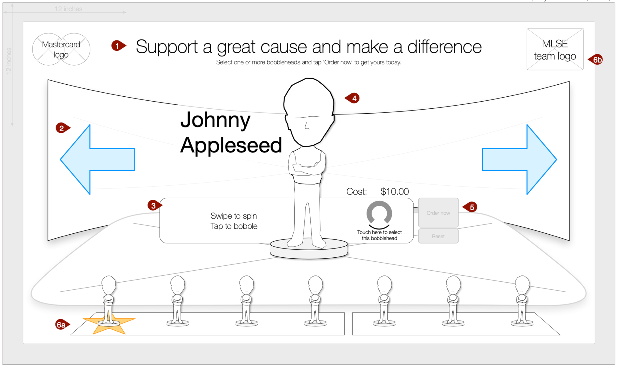
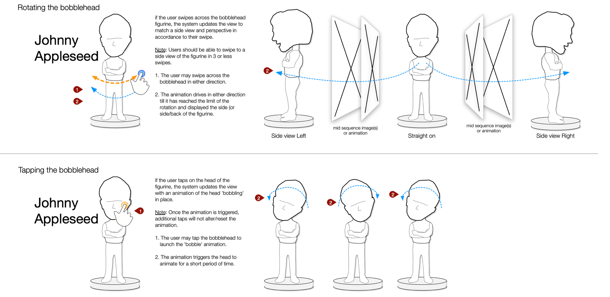
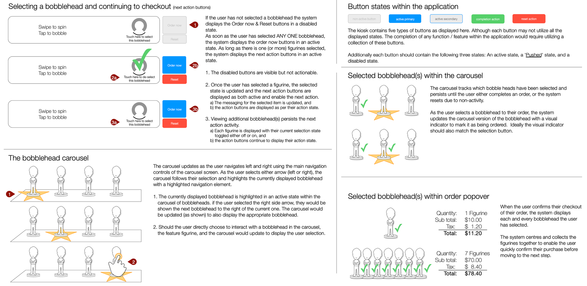
Sometimes it takes more than just wireframes in Figma to properly capture the interactions. This is where my old-school interaction documentation / design shines. Part of a larger project, the client wanted certain assurances that there would be adequate interaction, and that the design team would capture the various states of the app-components.
Our expertise in market scans and UX discovery ensures informed decision-making and enhanced user experiences. We help you stay ahead of trends, adopt innovative solutions, and create competitive, user-friendly digital experiences. Whether you're a large corporation or a startup, our tailored approach will guide your project to success.
