Case-study: Designing Calculators to be Comfortably Familiar
By standardizing the experience, Humanjava Enterprises helped CIBC better segment visitors, provide focused information, and enhance learning opportunities for new investors.

Across most banks and financial institutions in Canada, it's common to find dedicated sections on their websites for investing. When it came to financial planning at CIBC, the design brief was clear: standardize the experience, make it mobile-friendly, and provide clear next steps for people ready to invest.

Understanding the User Journey
How did you start your savings journey? Was it with the explicit goal of saving for retirement? Or was it moving from long-term savings to investing in financial products with better interest rates?
When it comes to long-term savings and investing, people generally take one of two approaches:
- Stick with their primary bank/financial institution and invest in long-term savings products.
- Hunt for the best rates at a trusted financial institution and open a dedicated account for long-term saving.
Regardless of the approach, the research phase typically includes comparing different prospective rates and evaluating the value of an investment over time.
Audience Insights and UX Considerations:
- Higher Cognitive Load: Investment planning and investing are not everyday activities. Calculators must support users with no financial product knowledge as well as savvy investors.
- Situational-Based Navigation: Calculators need to be simple for individual investors yet complex enough to include additional people.
- Warm-Lead Options: For users looking to learn more or open an account, the experience must provide clear next actions, tailored to the featured investment product.
- Inclusive Supporting Information: Each calculator should offer elegant paths to educational content, videos, and financial planning articles to cater to the diverse audience arriving via search.
- Tone of Voice and Messaging: Calculators must be accurate and reassuring for all visitors, from young investors to those nearing or in retirement.

Business Problem:
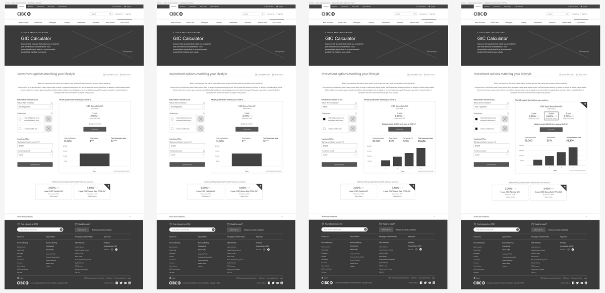
The calculators were initially designed for desktop web only and were not responsive. Our task was to create a mobile-friendly screen experience while also establishing a consistent look, feel, and next actions across all calculators.
Our North Star Statements:
Build each calculator to feel familiar, natural, and easy to use, enabling website visitors and branch staff to share a conversation about financial planning from the same side of the table.
Project Challenges:
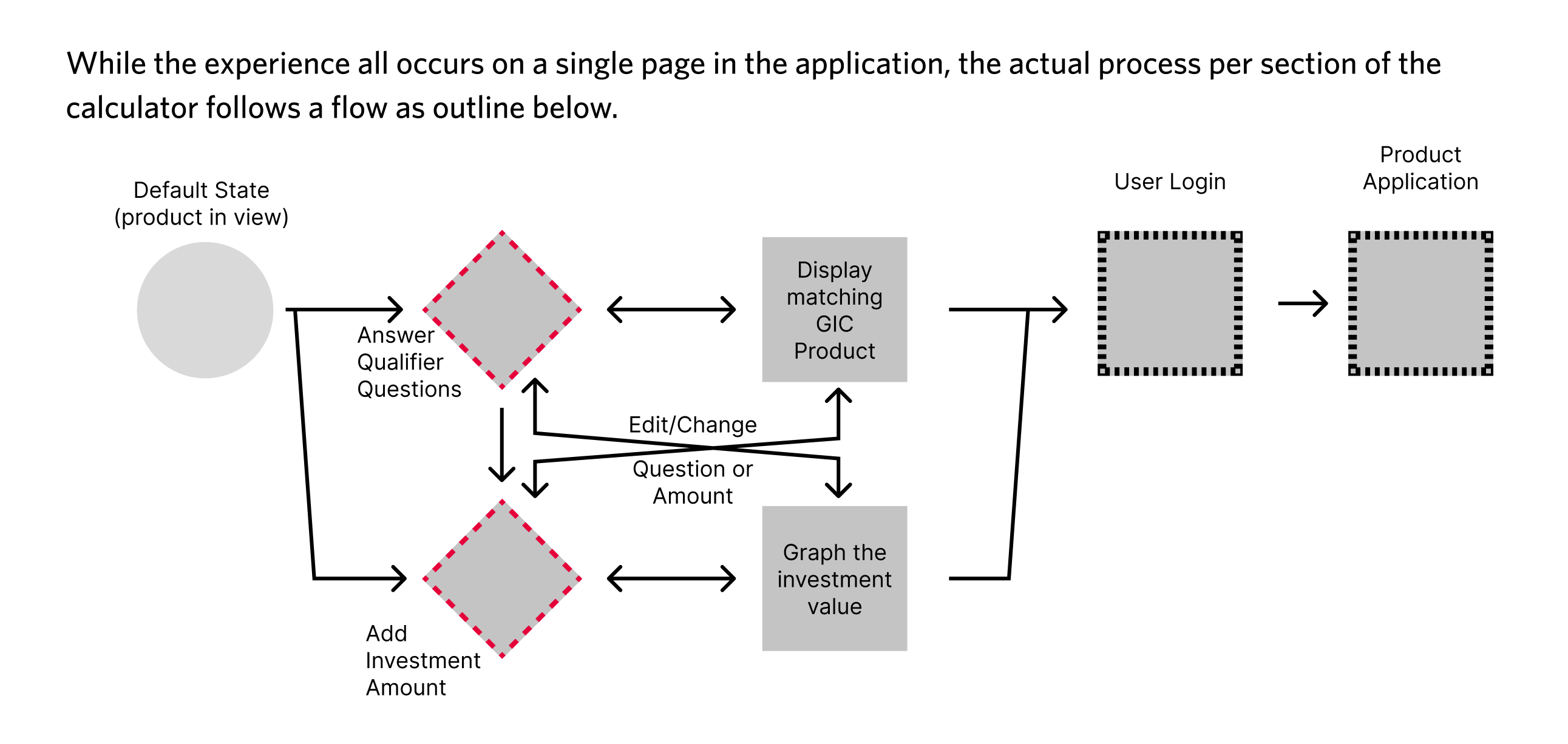
Creating a responsive web experience required innovative thinking. Multi-step forms with hidden fields and dynamic graphs based on user input demanded a simplified yet focused user experience. Additionally, tuning the next actions per calculator to the specific product required iterative design patterns, leading to some project rework.
The Resolution:
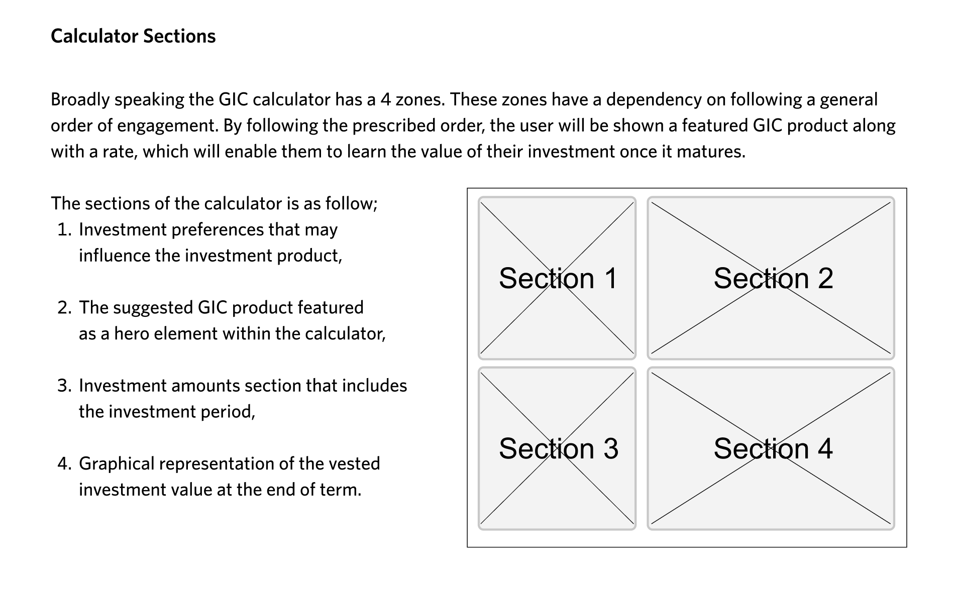
Improvements to the CIBC calculators resulted in a consistent and user-friendly experience. The various investment calculators were simplified into two formats: single-screen and multi-step condition-dependent flows. Business logic ensured the correct financial products were recommended based on user inputs. Users in the learning stage could access additional articles, while those ready to invest had clear next-action opportunities.
By standardizing the experience, Humanjava Enterprises helped CIBC better segment visitors, provide focused information, and enhance learning opportunities for new investors.
Our Commitment:
This case study with CIBC showcases Humanjava’s core values: creating user experiences that exceed user needs, enhancing business value, and establishing UX standards and consistency. Our commitment to improving the human experience through thoughtful, innovative solutions shines through in this project, demonstrating our ability to navigate complex requirements and deliver impactful results.
Explore our portfolio and discover how Humanjava Enterprises can be your partner in innovation and success.


